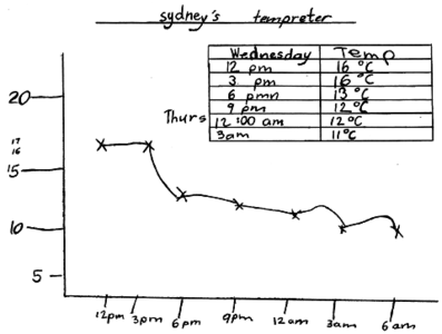
> P_CM_M3_E3_fig1
Make It Count is a project of The Australian Association of Mathematics Teachers (AAMT) Inc., funded by the Australian Government as part of the Closing the Gap initiative.
Graphic elements in this website derive from a painting by Angelina Doolan, Worowa College, Make It Count Healesville Cluster, 2011.
Graphic elements in this website derive from a painting by Angelina Doolan, Worowa College, Make It Count Healesville Cluster, 2011.

